
Rediscover our beauty for a more responsible wardrobe – Armocromia – 3rd episode
Italiano/English below

Puoi ascoltare qui l’articolo: Riscopriamo la bellezza – 3
Siamo alla terza puntata del percorso con l’image coach Jessica Pellegrino, per valorizzare la nostra immagine, orientando i nostri acquisti verso una maggiore consapevolezza, per un consumo di abbigliamento più sostenibile. L’argomento che approfondiamo con lei questa volta è l’armocromia: i colori, insieme a figura e stile, ci aiutano a individuare gli outfit giusti per noi. Non solo, Jessica in questo episodio ci racconta che il colore è qualcosa di più, collegato alla nostra interiorità e a ciò che desideriamo comunicare.
Se hai perso le puntate precedenti, puoi trovarle qui:
In ogni puntata troverai: le spiegazioni e i consigli di Jessica; suggerimenti riguardo libri, film o serie tv sull’argomento; esercizi da provare. Se hai domande o curiosità, clicca il bottone qui sotto per inviarcele. Buona lettura!

Oggigiorno quando si sente parlare di immagine e di image stylist si pensa subito all’armocromia, che va tanto di moda, ma già so che tu, Jessica, essendo anche una coach, avrai un approccio diverso! Partiamo dalle basi: cos’è l’armocromia?
“È una disciplina che in base alla combinazione o all’impatto di pelle, occhi e capelli definisce una gamma di colori ideale per ciascuno di noi, quindi una palette cromatica in grado di farci apparire più belle, giovani e luminose, come un effetto di make up naturale. La parola ‘armocromia’ sottolinea l’armonia cromatica tra i colori utilizzati, ma è molto di più. Dà quell’effetto magico di miglioramento e valorizzazione della nostra immagine, ma è anche una disciplina che ci aiuta nella vita professionale, creando un impatto differente per le nostre esigenze di dress code o di stile personale. Le combinazioni che si possono trovare grazie all’armocromia coinvolgono non solo la nostra immagine esteriore ma anche quella della nostra interiorità, perché intacca il nostro stile, la nostra personalità, ciò che vogliamo trasmettere”.
Quali tipi di stagioni ci sono? Come facciamo a capire che tipo siamo?
“È una domanda molto complessa. Quando si parla di armocromia si intendono quattro stagioni cromatiche ma ci sono ulteriori sottogruppi. Come un po’ con tutte le cose, non possiamo rientrare in maniera sistematica in un’unica categoria. Diciamo che nell’armocromia esistono quattro stagioni di riferimento, le nostre macro-aree, che all’interno si suddividono in tre sottogruppi più la stagione assoluta, andando per gradi. Le stagioni cromatiche sono: Inverno ed Estate, che hanno come similitudine il fatto di essere due stagioni tipicamente fredde, in cui rientrano persone che hanno un incarnato più freddo; Primavera e Autunno, che sono le stagioni definite calde, in cui rientrano persone con un incarnato più tendente al dorato.
Ogni sottogruppo tocca l’altro, si collegano perché hanno attinenze, per esempio il sottogruppo caldo sarà nelle stagioni Autunno e Primavera, il sottogruppo brillante nella Primavera e nell’Inverno. I sottogruppi si collegano l’un l’altro. Lo spiego perché per capire che tipo di stagione siamo si fa riferimento anche ai sottogruppi, perché è difficile fare un’autoanalisi per capire in quale stagione possiamo rientrare. Attraverso l’uso di drappi, quindi attraverso l’uso di alcuni colori messi accanto al viso, si guarda l’effetto che danno: laddove ci sarà un effetto più luminoso esaltando le caratteristiche del viso, quel tipo di colore sarà incluso nella nostra palette personale. Per esempio, io sono un Inverno freddo, il mio sottogruppo freddo va a toccare anche i colori dell’Estate fredda. Quindi due sottogruppi uguali si scambiano alcuni colori similari: alcuni colori dell’Estate fredda risalteranno sul mio viso perché è come se fossero colori ‘fratelli’ tra loro. Il bello dell’armocromia è proprio questo, avere una palette di riferimento ti permette di creare combinazioni cromatiche nel tuo outfit con gli abbinamenti che tu crei in modo efficace”.


Per favore, Jessica, ci fai un esempio di come potremmo individuare la nostra stagione?
“Per capire che tipo siamo, ci sono molti fattori che incidono. Potete provare con i colori da evitare. Capirete per esempio se la vostra stagione è l’Autunno se vedrete che il fucsia vi sta male. Paragonando il fucsia con l’arancio, se l’arancio vi sta meglio del fucsia, allora vuol dire che avete più colori caldi. La regola di base è guardare sempre in prima battuta l’oro e l’argento: quale dei due colori funziona meglio su di voi? Se l’argento si esalta meglio, allora sicuramente entriamo in una categoria fredda. Non è detto che ci sia esattamente uno dei due colori che possa funzionare meglio sull’altro, perché se il vostro sottogruppo è scuro (quindi potete rientrare nell’Inverno scuro con il sottogruppo scuro o nell’Autunno con sottogruppo scuro), non si vedrà molto la differenza tra l’oro e l’argento. Se i colori più scuri che hanno un contrasto più alto mi stanno meglio dei colori più brillanti, so che tra l’Inverno e l’Estate punterò più sull’Inverno, viceversa invece entrerò nella categoria Estate. La regola di base per una perfetta analisi armocromatica è tener conto della pelle, degli occhi e dei capelli per definire la stagione, ma è la pelle che comanda. Gli occhi o i capelli sono secondari. Un aspetto importante: l’analisi di armocromia va fatta assolutamente senza trucco, per vedere effettivamente le caratteristiche del nostro viso e della nostra pelle”.
Di solito in una palette quanti colori ci sono? C’è scelta oppure rischio di indossare sempre quei 2-3 colori?
“Di colori ce ne sono veramente tanti, si parla di almeno una sessantina.  Oltre la palette cromatica che è già molto vasta e soprattutto in cui è ben mixabile un colore con l’altro, se abbiamo un sottogruppo dove la nostra stagione di riferimento spicca più di altre, andremo a ‘rubare’ alcuni colori nell’altra stagione che ha lo stesso sottogruppo. Per esempio, se sono Primavera con sottogruppo brillante, potrò rubare alcuni colori della palette Inverno con sottogruppo brillante, perché Inverno e Primavera hanno appunto il sottogruppo bright in comune”.
Questo vuol dire che ora prendo e butto tutto ciò che non è nella palette?
“No, il mio approccio non è assolutamente questo! Tendo a guardare l’armocromia come un mezzo di valorizzazione, come giustamente deve essere, ma nel momento in cui faccio un’analisi non posso pretendere di cambiare dall’oggi al domani il mio guardaroba. Non solo per un un discorso economico, ma anche di sostenibilità. È un processo graduale. Nel mio caso personale, ho impiegato 2 anni ad avere un guardaroba in palette. Rientrando in una stagione di Inverno freddo, i forti contrasti mi stanno bene perché ho un contrasto alto, però ci sono alcuni colori che per me sono troppo forti. Quindi posso prediligerne qualcuno più attenuato, è una cosa tipica che fa l’Inverno freddo, prendendo qualche colore caldo perché ci sembra che in qualche modo smorzi questo contrasto troppo alto. In realtà ci penalizza, perché l’Inverno freddo assolutamente non va bene coi colori caldi. Avendo alcuni colori nel mio guardaroba come il marrone o il beige o l’oro che usavo moltissimo, ho dovuto pian pianino toglierli. Questo significa che non è che non saremo valorizzate finché non avremo un guardaroba in palette, ma sicuramente gli abiti che noi abbiamo possiamo abbinarli a colori che sono invece nella nostra palette di riferimento o mettere gli accessori vicino al viso che siano dei nostri colori ‘amici’. Poi man mano che i capi faranno il loro decorso li sostituiremo con altri della nostra stagione di riferimento. Quindi non è una cosa che si fa dall’oggi al domani ma con il tempo. Questo aiuta anche a consapevolizzare l’effetto che hanno alcuni colori su di noi“.
Hai suggerimenti per abbinare tra loro i colori? Variano per ogni tipo durante l’anno o restano gli stessi (che sia estate, inverno, ecc.)?
“Parto dal presupposto che chi ha un guardaroba in palette ha il grande vantaggio di utilizzare colori fratelli, che hanno una comunanza tale da permettere di poter creare qualsiasi abbinamento senza mai sbagliare un colpo.  Questo è il grande vantaggio aureo dell’armocromia ed è l’aspetto che mi ha fatto innamorare di questa disciplina, ogni giorno vedo lati sempre più belli di questo strumento disponibile per tutte. La tecnica che posso suggerire è la combinazione cromatica in alcuni step: ad esempio l’abbinamento può essere monocromatico, utilizzando un unico colore combinando le tinte, le ombre, i toni e guardando sulla ruota cromatica utilizzerò quel colore in qualunque scala (dal più chiaro al più scuro, dal più opaco al più brillante, in tutte le gradazioni possibili). Oppure posso utilizzare dei colori analoghi, basta scegliere una tonalità su una ruota cromatica e abbinare i due colori che sono adiacenti. O ancora posso utilizzare l’abbinamento complementare, che sono due colori uno di fronte all’altro sulla ruota dei colori e che mescolati si annullano ma affiancati invece si esaltano. Abbiamo poi un’altra combinazione che è quella con i colori neutri: in base alla tua palette di riferimento ci saranno dei neutri, quindi per le stagioni fredde il bianco, il nero e il grigio, per le stagioni calde il beige, il marrone, l’avorio e si creano combinazioni cromatiche che possono funzionare perché sono neutre tra loro. Poi abbiamo i complementari divisi e infine l’esempio della triade equidistante (si usano tre colori equidistanti sulla ruota cromatica): questa combinazione ha un effetto stimolante e molto carino, spesso usata nell’abbigliamento sportivo”.
E se un colore mi piace moltissimo ma non è indicato per il mio tipo?
“Può capitare che ci siano dei colori che ci piacciono particolarmente ma che non ci stiano bene e che su di noi non funzionino.  Arriveremo a un certo punto a consapevolizzare il fatto che quei colori non ci stanno bene e che altri invece ci mostrano più belle, così andremo a scegliere questi ultimi perché la nostra scelta sarà di guardarci allo specchio con soddisfazione. Se non siamo abituate a guardarci allo specchio con soddisfazione, siamo portate a indossare i colori che su di noi possono non funzionare, un po’ per abitudine, un po’ perché non crediamo di poterci vedere o sentire più belle. Nel momento in cui impariamo a conoscere cosa ci fa veramente vedere e sentire più belle, automaticamente cambia anche il nostro gusto personale. Posso crearmi altri colori preferiti, perché quando me li vedo addosso mi piaceranno talmente tanto, mentre i colori che non mi stanno bene passeranno inosservati, non smetteranno di piacerci perché fa parte del nostro gusto personale ma non ci piacerà più indossarli. Diventerà un ragionamento automatico dentro di noi. Nel caso in cui ci sono dei colori a cui assolutamente non riusciamo a rinunciare, posso utilizzarli tenendoli lontano dal viso, studiando la combinazione cromatica in modo più sapiente, perché i colori che non sono nella mia palette devono essere abbinati con un pochino più di accortezza”.
Ti è capitato Jessica di affezionarti a colori che non ti stavano bene?
“Sì, adoravo il giallo senape e l’arancione, ma mentre già prima dell’analisi cromatica avevo visto che quest’ultimo non mi stava bene avevo invece tantissimo giallo senape nell’armadio. Dopo qualche anno che avevo il mio guardaroba in palette, ho trovato un cappottino color senape che amavo alla follia e in un momento di ribellione l’ho provato. Quando l’ho indossato, ho visto la mia faccia, truccata con i colori nella mia palette: sembrava malata, era diventata gialla-verdognolo bruttissimo. La mia mente voleva acquistare tantissimo quel cappottino, ma i miei occhi vedevano che stavo talmente male e non ho avuto il coraggio di acquistarlo. Questa accortezza visiva si acquisisce pian piano. L’ho acquisita con il tempo e ora che mi sono fatta l’occhio, devo dire la verità, non tornerei più indietro”.
Cosa c’entrano i colori con il nostro percorso? Perché ne parliamo? Come ci aiutano a fare acquisti consapevoli?
“I colori c’entrano nel nostro percorso perché è un discorso di consapevolezza. 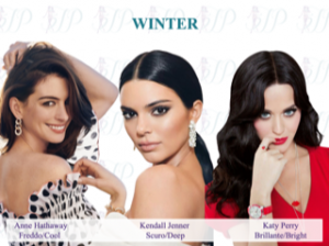 Se desidero acquistare in maniera consapevole e investo una somma per acquistare un capo che voglio mi duri nel tempo, devo essere certa che indosserò quel capo. Arriverò a un armadio pieno di vestiti con nulla da mettere se acquisto un capo che poi non utilizzerò perché quando metto quel colore mi sbatte o mi fa sembrare più malata, più spenta o ha un taglio che mi ingrossa e mi fa sentire più goffa o non mi piace lo stile. Colore, figura e stile ci consentono di fare un acquisto mirato di un capo che utilizziamo“.
Come si collega la scelta dei colori con il nostro lato interiore, con il percorso di coaching?
“Il colore è uno strumento potentissimo anche a livello emotivo, perché comunica un messaggio. Per esempio, il blu è un colore della logica, trasmette nobiltà, eleganza, raffinatezza, ordine, affidabilità, autorevolezza e anche pace. Oppure l’arancio può stimolare l’azione, è un colore vitale. O il rosso, che trasmette energia, azione, passione innovazione. O ancora il viola che invece magari è un colore più mistico, il verde che può generare relax e creatività. Il rosa è un colore tipicamente femminile, indica delicatezza, accoglienza, empatia, innocenza. I classici grigio e nero sono simbolo di affidabilità, distacco, saggezza, autorevolezza ma anche mancanza di creatività. Marrone e oro indicano relax, tradizione, ecofriendly, calma. Ogni colore ha un suo messaggio, quindi possiamo sceglierlo per comunicare qualcosa se dobbiamo presentarci in un contesto portando un messaggio preciso. Ma soprattutto servono a trasmettere la nostra interiorità, quindi anche la nostra personalità e il nostro stile personale. La nostra interiorità è molto sfaccettata, poterla trasmettere attraverso la nostra immagine esteriore è un aspetto complicato. Nel mio percorso Strong, lavorando sulla nostra immagine interiore scattano quei meccanismi che ci permettono di poter fare un passo in più: fare in modo automatico alcune scelte che ci fanno stare bene nel nostro abbigliamento e nel modo in cui presentiamo la nostra immagine esteriore (l’acconciatura, il make-up, la cura del corpo, i trattamenti per il viso). Con il colore è più facile trasmettere quello che abbiamo dentro. Se per esempio desidero sentirmi più femminile, utilizzerò nuance più sul rosa, se voglio sentirmi più elegante posso puntare su colori come il blu e il nero, tenendo conto sempre ovviamente della palette”.


Hai una storia di una tua cliente riguardo i colori?
“Nel 2018 una cliente stava vivendo un cambiamento molto importante nella sua vita, un trasferimento in una nuova casa e non stava più lavorando da un po’ di tempo. Una mattina si è resa conto di punto in bianco di avere un guardaroba prettamente nero e questo le ha portato un po’ di sconforto, perché c’era qualcosa che non andava nella sua vita. Abbiamo iniziato insieme un percorso in cui c’era anche un’analisi armocromatica da cui è emerso che era una stagione Inverno. Nel suo caso tecnicamente il colore nero funzionava, il problema però era che non le faceva trasmettere chi era davvero, quello che voleva comunicare di se stessa e come voleva prendersi cura di sé: il nero era diventato un mezzo per nascondersi, per fare un passo indietro e tenere in stand-by quello che non stava portando avanti nella sua vita. I cambiamenti che aveva avuto erano stati talmente drastici che in qualche modo avevano fatto perdere la bussola, non sapeva più se voleva fare il lavoro che aveva sempre fatto o intraprendere una nuova carriera o stare a casa o seguire corsi e cambiare stile di vita. Non avendo uno strumento con cui lavorare su questo, il nero è come se fosse stato il suo mezzo per mettere in stand-by, per non dover scegliere che cosa e in che modo mostrarsi. Tre mesi fa, mi ha mandato su WhatsApp una foto del suo guardaroba mostrandomi quanti colori stava integrando, ringraziandomi ancora perché in questo anno e mezzo ha continuato a valorizzarsi e a trasmettere la sua personalità attraverso il colore e gli altri insegnamenti che le avevo fornito. Mi ha chiesto quindi di fare insieme il percorso Strong, che ha deciso di regalarsi. Voleva ancora di più valorizzarsi, era rimasta incinta, aveva avuto un bambino e tanti cambiamenti anche a livello fisico, le era servito molto il percorso fatto insieme, quindi sentiva la necessità di fare un passo in più nella conoscenza di se stessa . Il fatto di essere riuscita a valorizzarsi nonostante questi cambiamenti ancora più forti le ha fatto capire quanta forza ci possa essere dietro a un percorso in cui si lavora su se stessi. Abbiamo iniziato e sono molto felice perché i progressi sono veramente lampanti. È una di quelle storie che mi porto nel cuore. In realtà ogni cliente fa parte un po’ di un pezzettino del mio cuore, ognuna ha una storia che ha un richiamo su di me, un racconto che in qualche modo mi risuona perché fa parte un po’ anche del mio bagaglio di esperienze”.
Libri, film, serie tv che Jessica consiglia
- Via col vento (film). Per chi non lo sapesse è uno di quei film in cui le stylist hanno utilizzato molto il colore per trasmettere da una parte una personalità dei personaggi, dall’altra anche lo stato d’animo che stavano vivendo in quel momento storico del loro percorso di vita. Si può vedere ad esempio nel modo in cui utilizzavano i colori più freddi e brillanti, che erano nella sua palette, nei momenti allegri, belli e positivi della vita della protagonista Rossella O’Hara. Poi c’erano invece momenti più bui e difficili in cui sono stati utilizzati colori che non erano nella sua paletta, la penalizzavano molto sul viso. L’attrice era sempre splendida ma si vedeva la differenza tra un colore e l’altro.
- Colorstrology di Michele Bernhardt (libro)
- Color me beautiful di Carola Jackson (libro)
- Più bella con i tuoi colori di Cinzia Felicetti (libro)
- Cromorama di Riccardo Falcinelli (libro)
Aspettando la prossima puntata, ti proponiamo alcune attività per provare a mettere in pratica i suggerimenti di Jessica. Se ti va, condividi con noi i risultati (scrivendoci oppure postando sui nostri account Facebook o Instagram).
Gli esercizi sull’armocromia:
Puoi trovare gli esercizi nel corso on line di Jessica 5 segreti per sentirti più bella
Un esercizio sui colori nel tuo armadio:
Prova a scrivere una lista dei colori dei diversi tipi di indumenti (magliette, camicie, pantaloni, gonne, maglioni, scarpe, ecc.) del tuo guardaroba. Quindi prova a rispondere a queste domande:
- Ci sono colori con cui ti vedi meglio?
- Quali colori hanno i capi che indossi più frequentemente?
- E quelli che non metti mai?
Ti aiuterà a capire da una parte con quali colori ti senti meglio, dall’altra se i vestiti che utilizzi di meno hanno un colore o una tipologia di tinte (esempio, tonalità scure oppure toni freddi o ancora tinte accese) in comune tra loro. Seguendo le indicazioni di Jessica prova a capire cosa comunicano i colori preponderanti sia tra gli abiti che indossi di più, sia tra quelli che usi meno frequentemente.
Dove puoi trovare Jessica Pellegrino:
– Corsi https://jpacademy.teachable.com/?affcode=173147_5izhjbfb
– Sito https://www.jessicapellegrino.com/
– FB https://www.facebook.com/jessicapellegrinoimagestylist/
– IG https://www.instagram.com/jessicapellegrinoimagestylist/
– YouTube www.youtube.com/channel/UCQpRucUm1V0BE5b7Yk5vhEw?
– Spreaker https://www.spreaker.com/user/jessicapellegrino
-

Jessica Pellegrino
English – Rediscover our beauty for a more responsible wardrobe – Armocromia – Third episode
We are at the third episode of the journey with the image coach Jessica Pellegrino, to enhance our image, directing our purchases towards greater awareness, for a more sustainable consumption of clothing. The topic that we deepen with her this time is the colour analysis: the colors, together with figure and style, help us to find the right outfits for us. Not only that, in this episode Jessica tells us that color is something more, connected to our interiority and to what we want to communicate.
If you missed the previous episodes, you can find them here:
In each episode you will find: Jessica’s explanations and advice; suggestions regarding books, films or TV series on the subject; exercises to try. If you have questions or curiosities, click the button below to send them to us. Enjoy the reading!
Nowadays when you hear about image and image stylist, you immediately think of armocromia (the color analysis), which is so fashionable, but I already know that you, Jessica, being also a coach, will have a different approach! Let’s start from the basics: what is armocromia?
“It is a discipline which, based on the combination or impact of skin, eyes and hair, defines an ideal range of colors for each of us, therefore a chromatic palette capable of making us appear more beautiful, young and luminous, as an effect of natural make up. The word ‘armocromia’ underlines the chromatic harmony between the colors used, but it is much more. It gives that magical effect of improvement and enhancement of our image, but it is also a discipline that helps us in professional life, creating a different impact for our dress code or personal style needs. The combinations that can be found thanks to the color harmony involve not only our external image, but also that of our interiority, because it affects our style, our personality, what we want to convey”.
What types of seasons are there? How do we understand what kind we are?
“It is a very complex question. When we talk about armocromia we mean four chromatic seasons, but there are further subgroups. As with all things, we cannot systematically fall into a single category. There are four seasons of reference, our macro-areas, which are divided into three subgroups plus the absolute season, going gradually. The chromatic seasons are: Winter and Summer, which have the similarity of being two typically cold seasons, in which people who have a colder skin fall; Spring and Autumn, which are defined as warm seasons, in which people with a more golden skin fall. 
Each subgroup touches the other, they connect because they have relevance, for example the warm subgroup will be in the Autumn and Spring seasons, the bright subgroup in the Spring and Winter. The subgroups connect to each other. I explain it because to understand what type of season we are, we also refer to subgroups, being difficult to do a self-analysis to understand which season we are part of. Through the use of drapes, i.e. through the use of some colours placed next to the face, we look at the effect they give: where there will be a brighter effect enhancing the characteristics of the face, that type of color will be included in our own palette. For example, I am a cold Winter, my cold subgroup also touches the colors of the cold Summer. So two identical subgroups exchange some similar colors: some colours of the cold Summer will stand out on my face because it is as if they were ‘brothers’ colours between them. The beauty of armocromia is just that, having a reference palette allows you to create color combinations in your outfit with the combinations that you create effectively”.
Can you please provide us with an example of how we could identify our season?
“To understand what type we are, there are many factors that affect. You can try with the colors to avoid. For example, you will understand if your season is Autumn if you see that fuchsia looks bad on you. Comparing fuchsia with orange, if orange is better than fuchsia, then it means that you have more warm colors. The basic rule is to always look at gold and silver first: which of the two colors works best on you? If silver exalts ourself better, then we certainly enter a cold category. It is not said that there is exactly one of the two colours that can work better on the other, because if your subgroup is dark (so you can reenter in the dark Winter with the dark subgroup or in the Autumn with dark subgroup), you will not see it very much the difference between gold and silver. If the darker colours that have a higher contrast are better than the brighter colors, I know that between Winter and Summer I will focus more on Winter, vice versa instead I will enter the Summer category. The basic rule for perfect colour analysis is to take the skin, eyes and hair into account when defining the season, but it is the skin that commands. The eyes or hair are secondary. An important aspect: the analysis of armocromia must be done absolutely without make-up, to actually see the characteristics of our face and our skin”.
How many colours are usually in a palette? Is there a choice or risk of wearing always the same 2-3 colours?
“There are really many colours, at least sixty. In addition to the colour palette which is already very large and above all in which one colour is well mixable with the other, if we have a subgroup where our reference season stands out more than others, we will ‘steal’ some colours in the other season that has the same subgroup. For example, if I am Spring with bright subgroup, I will be able to steal some colours of the Winter palette with bright subgroup, because Winter and Spring have precisely the bright subgroup in common”.
Does this mean that I now throw everything that is not on my palette?
“No, this is definitely not my approach! I tend to look at armocromia as a tool of enhancement, as it rightly must be, but when I do an analysis I cannot pretend to change my wardrobe overnight. Not only for an economic issue, but also for sustainability. It is a gradual process. In my personal experience, it took me 2 years to have a pallet wardrobe. Being included in a cold Winter season, the strong contrasts are fine because I have a high contrast, but there are some colours that are too strong for me. So I can prefer some softer ones, it is a typical thing that makes the cold Winter, taking some warm colours because it seems to us that somehow it softens this too high contrast. In reality it penalizes us, because the cold Winter is absolutely not good with warm colours. Having some colours in my wardrobe such as brown or beige or gold that I used a lot, I had to slowly remove them. This doesn’t mean that we will not be valued until we have a wardrobe in the palette, but surely we can combine the clothes we have with colours that are instead in our reference palette or put the accessories with our ‘friend colours’ ‘ close to the face. Then, as the garments make their course, we will replace them with others from our reference season. So it is not something that is done overnight but with time. This also helps to understand the effect that some colours have on us“.
Do you have any suggestions for matching colours? Do they vary for each type during the year or do they remain the same (be it summer, winter, etc.)?
“I assume that whoever has a wardrobe in a palette has the great advantage of using ‘brother’ colours, which have a commonality that allows you to create any combination without ever missing a shot. This is the great advantage of armocromia and it is the aspect that made me fall in love with this discipline, every day I see more and more beautiful sides of this tool available for everyone. The technique that I can suggest is the chromatic combination in few steps: for example the combination can be monochromatic, using a single color by combining the hues, shadows, tones and looking on the chromatic wheel I will use that color in any scale (from the lightest to the darkest, from the most opaque to the brightest, in all possible shades). Or I can use similar colours, just choose a shade on a colour wheel and combine the two colors that are adjacent. Or I can use the complementary combination, which are two colours facing each other on the color wheel and which when mixed together cancel each other but instead exalt each other. Then we have another combination which is the one with neutral colors: according to your reference palette there will be neutrals, therefore for the cold seasons white, black and gray, for the warm seasons beige, brown, ivory and colour combinations are created that can work because they are neutral to each other. Then we have the divided complementaries and finally the example of the equidistant triad (three equidistant colours are used on the colour wheel): this combination has a stimulating and very nice effect, often used in sportswear”.
What if I like a colour very much but it is not suitable for my type of season?
“It may happen that there are colours that we particularly like but that are not good for us and that do not work on us. We will arrive at a certain point to become aware of the fact that those colours are not good for us and that others make us more beautiful, so we will choose the latter because our choice will be to look at ourselves in the mirror with satisfaction. If we are not used to looking at ourselves in the mirror with satisfaction, we are led to wear colors that may not work on us, a little out of habit, a little because we do not believe we can see or feel more beautiful. The moment we learn about what really makes us see and feel more beautiful, our personal taste also automatically changes. I can create other favorite colours, because when I see them on me I will like them so much, while I won’t consider the colours that don’t look good on me, we will not stop liking them because it is part of our personal taste but we will no longer like to wear them. It will become an automatic reasoning within us. In case there are colours that we absolutely cannot give up, we can use them keeping them away from the face, studying the chromatic combination in a wiser way, because the colours that are not in my palette must be combined with a little more attention”.
Did it happen to you, Jessica, loving you a colour that doesn’t suit you?
“Yes, I loved mustard yellow and orange, but while already before the color analysis I had seen that the latter was not fine, I had a lot of mustard yellow in the closet instead. After a few years that I had my wardrobe in pallets, I found a mustard-colored coat that I loved madly and in a moment of rebellion I tried it. When I wore it, I saw my face, I had the make up with the colours in my palette: my face looked sick, it had become very ugly yellow-greenish. My mind wanted to buy that coat a lot, but my eyes saw that I looked so bad and I didn’t have the courage to buy it. This visual wisdom is gradually acquired. I acquired it overtime and now that I’ve got the sharpen eye, honestly I wouldn’t go back”.
What do colors have to do with our path? Why do we talk about it? How do they help us make conscious purchases?
“Colours have to do with our path because it is an issue of awareness. If I want to buy consciously and I invest a sum to buy a garment that I want to last over time, I must be sure that I will wear that garment. I will come to a closet full of clothes with nothing to wear if I buy a garment that I will not use because when I put that color it bangs me or makes me look sicker, duller or it has a cut that enlarges me and makes me feel more awkward or I do not i like the style. Colour, shape and style allow us to make a targeted purchase of a garment that we use“.
How does the choice of colours connect with our inner side, with the coaching path?
“Colour is a very powerful tool also on an emotional level, because it communicates a message. For example, blue is a color of logic, it conveys nobility, elegance, refinement, order, reliability, authority and even peace. Or orange can stimulate action, it is a vital color. Or red, which transmits energy, action, passion, innovation. Or purple, which is perhaps a more mystical color, green which can generate relaxation and creativity. Pink is a typically feminine color, it indicates delicacy, welcome, empathy, innocence. The gray and black classics are a symbol of reliability, detachment, wisdom, authority but also a lack of creativity. Brown and gold indicate relaxation, tradition, eco-friendly, calm. Each color has its own message, so we can choose it to communicate something if we have to present ourselves in a context by bringing a precise message. But above all they serve to convey our interiority, therefore also our personality and our personal style. Our interiority is very multifaceted, being able to transmit it through our external image is a complicated aspect.  In my Strong path, working on our internal image those mechanisms that allow us to be able to take a step further are activated: to make automatically some choices that make us feel good in our clothing and in the way we present our external image (hairstyle, make-up, body and facial care). With colour it is easier to transmit what we have inside. For example, if I want to feel more feminine, I will use more shades of pink, if I want to feel more elegant I can focus on colours such as blue and black, always obviously taking into account the palette”.
Do you have a story of your client about colours?
“In 2018, a client was experiencing a very important change in her life, a move to a new home and she had not been working for some time. One morning she realised all of a sudden that she had a purely black wardrobe and this brought her a bit of discomfort, because there was something wrong with her life. We started a journey together in which there was also a colour analysis, from which it emerged that it was a Winter season. In her case technically the black color worked, the problem however was that it did not let her convey who she really was, what she wanted to communicate about herself and how she wanted to take care of herself: black had become a means of hiding, of taking a step back and keep on standby what she was not carrying on in her life.
The changes that she had had been so drastic that somehow had made her lose control, she no longer knew if she wanted to do the job she had always done or embark on a new career or stay at home or take courses and change lifestyle. Having no tool to work with on this, black was her means of putting on stand-by, so as not to have to choose what and how to show herself.  Three months ago, she sent me a photo of her wardrobe on WhatsApp showing me how many colours she was integrating, thanking me again because in this year and a half she continued to enhance herself and to transmit her personality through the colour and the other teachings that I had given her. So he asked me to do the Strong path together, which she decided to treat herself. She wanted to enhance even more her value, she had become pregnant, she had had a baby and many changes also on a physical level. The fact that she managed to enhance herself despite these even stronger changes made her understand how much strength there can be behind a path in which she works on herself. We started and I’m very happy because the progress is really clear.
It is one of those stories that I carry in my heart. In reality, each customer is part of a little bit of my heart, each has a story that has a call on me, a story that somehow resonates because it is also part of my baggage of experiences”.
Books, movies, tv series suggested by Jessica
- Gone with the Wind (movie). For those who don’t know, it is one of those films in which the stylists have used a lot of colour to convey on one hand a personality of the characters, on the other also the mood that they were experiencing in that historical moment of their life path. You can see, for example, in the way the coldest and brightest colours were used, which were in her palette, in the happy, beautiful and positive moments of the life of the protagonist Rossella O’Hara. Then there were instead darker and more difficult moments in which colours outside her palette were used, penalising her very much on the face. The actress was always beautiful but you could see the difference between one colour and another.
- Colorstrology by Michele Bernhardt (book)
- Color me beautiful by Carola Jackson (book)
- Più bella con i tuoi colori by Cinzia Felicetti (book)
- Cromorama by Riccardo Falcinelli (book)
Exercises on the colour analysis:
You can find them in Jessica’s on line course 5 segreti per sentirti più bella
An exercise on colours in your closet:
Try writing a list of the colours of your different types of clothing (T-shirts, shirts, pants, skirts, sweaters, shoes, etc.) in your wardrobe. Then try replying this questions:
- Are there colours with which you look better?
- What colours do the garments you wear most frequently have?
- And the ones you never wear?
It will help you understand on the one hand which colors you feel better with, on the other hand if the clothes you use the least have a color or a type of color (for example, dark shades or cold tones or bright colors) in common with each other. Following Jessica’s instructions, try to understand what the predominant colors communicate both among the clothes you wear the most and among the ones you use less frequently.
Where you can find Jessica Pellegrino:
– Courses https://jpacademy.teachable.com/?affcode=173147_5izhjbfb
– Website https://www.jessicapellegrino.com/
– FB https://www.facebook.com/jessicapellegrinoimagestylist/
– IG https://www.instagram.com/jessicapellegrinoimagestylist/
– YouTube www.youtube.com/channel/UCQpRucUm1V0BE5b7Yk5vhEw?
– Spreaker https://www.spreaker.com/user/jessicapellegrino
Photos: Siora photography, Jessica Pellegrino, Dress ECOde (allrighstreserved), Sharon Pittaway, David Pisnoy.


Potrebbero piacerti anche

Shein: the false statements about the factories of the ultra-fast-fashion brand

The worrying situation of human and labour rights in Cambodia: 20 apparel and footwear companies write to the prime minister
